Document Type : Original article
Abstract
Background: Given the importance of the Intensive Care Unit (ICU), it is necessary to monitor the performance of this department to provide the urgent information required for clinical and managerial decision making. Its use can play an important role in improving the performance of the ICU. The aim of this study was to develop a clinical dashboard to monitor key performance indicators in ICU of Imam Khomeini Hospital affiliated to Urmia University of Medical Sciences.
Methods: The current study was carried out as a descriptive study in 4 main phases, in 2019. In the first phase, key performance indicators were determined through an electronic questionnaire. In the second phase, the dashboard was designed based on the user and technical requirements. In the third Phase, the dashboard was implemented in ICU of Imam Khomeini Hospital at Urmia. In the final phase, the dashboard usability was evaluated through the think aloud method.
Results: A total of 28 key performance indicators in 3 categories were considered essential for the ICU dashboard from the perspective of intensive care professionals. The dashboard was created using the PHP programming language and MySQL database management system. The dashboard was implemented in the ICU, and information of 400 patients was entered online. Based on the data entered for each patient, the indicators were automatically calculated. After the physicians and nurses worked with different sections of the dashboard, their comments were used to improve visual features of the dashboard.
Conclusion: The designed dashboard in the present study can be a useful tool for better understanding of the patients’ clinical conditions. It also enables managers to monitor the healthcare quality of the ICU department in real-time based on the key performance indicators.
Keywords: Clergy, Database management systems, Hospitals, Humans, Intensive care units, Programming languages, Quality of health care
Background
The Intensive Care Unit (ICU) is one of the most important departments in hospitals that supplies demanding assistance to recover the lives of patients (1). According to the SCCM reports, 5.7 million patients are admitted to ICU units annually which occupy 10% of hospital beds, and about 30% of the costs are allocated to acute hospital care (2,3). Based on researches, the average ICU mortality in the US is from 8 to 19 percent, and approximately 500,000 deaths occur annually (4). This statistic reaches 21% to 30% in Iran (5,6).
The ICU is a complex socio-technical environment that holds specialized human work and advanced monitoring technologies (7). Over 1,200 data are collected per patient per day, complicating care and information overload in the ICU. It is important that practitioners access to large volumes of data from various sources (8,9).
Due to sensitive and complex conditions such as regular monitoring of patients’ condition, multiple interventions, overwork, and staff changes in the intensive care unit, medical errors occur more frequently in this department (10,11). Therefore, managers and healthcare professionals of ICU are seeking effective solutions and tools to increase the monitoring and feedback for promoting quality of care (12). Dashboards are one of the main types of tools applied to evaluate and analyze data with graphical display and the real-time presentation of data (12,13). In fact, a dashboard is a visual tool for rapid representation of an organization’s performance which is displayed on a single screen with the most up-to-date information on key performance indicators in a concise, easy-to-understand format to promote informed decision making effectively (8,14,15).
In designing a dashboard defining and understanding Key Performance Indicators (KPIs) based on features such as meaningfulness, controllability, and measurability is a critical requirement (16,17). A dashboard through standardizing and highlighting meaningful data enables monitoring, analyzing, and identifying problem areas (18). Also, dashboards allow users to manage the scope and content of the information demonstrated and evade overburden in dealing with an enormous volume of information (19). The ICU has a high capacity to apply dashboards due to its complex services and a dynamic environment (20). Performance enhancement attempts in the ICU require the creation of a set of quality indicators for continuous measurement of performance (20). The dashboard helps to promote healthcare quality, resource management, and employees’ accountability (21).
The ICU beds are the most valuable hospital resources due to the high demand and vital needs of patients, and usually hospitals face shortage of beds (21-23). The development of the dashboard in the ICU can be very effective in the utilization of the bed and improving the quality of services provided (21). Dashboard technology in the ICU has been applied for monitoring of ICU bed occupancy(24), providing safety and quality of PICU services (25), managing of ventilator (26), and reducing of ventilator-associated pneumonia (27). The results of these researches showed that the development of the dashboard leads to reduction of waiting time and optimal bed management, early identification of patients at risk, appropriate interventions, increased patient safety, and cooperation among health care team members (24,25,28).
Considering the importance of the ICU in providing critical services to patients, the costs incurred as well as the challenges that exist in this department, it is necessary to monitor the performance of this department and dashboards to provide timely display of the information necessary for clinical and managerial decision making. Its use can play an important role in improving the performance of the ICU and the quality of patient care. Therefore, the purpose of this study was to develop a clinical dashboard for monitoring key performance indicators in the ICU unit of Imam Khomeini Hospital affiliated to Urmia University of Medical Sciences.
Materials and Methods
This research is a descriptive cross-sectional study conducted in 2019 that was supported by the Research Committee of Urmia University of Medical Sciences, and was performed in the general ICU of Imam Khomeini Hospital as a kidney transplant pole and trauma center in the northwest of the country, in West Azerbaijan province with a population of about 3.3 million. The hospital has 523 beds in 30 wards. The development of the ICU dashboard in this research was done in 3 main phases.
The first phase: determining the key performance indicators
After reviewing and studying scientific contents in the field of key performance indicators in the ICU, an electronic questionnaire was designed with multiple choice answers and free suggestion section. Intensive care professionals were asked to determine the value of KPIs using a five-point Likert scale (1 low to 5 very important). Important items analyzed by experts were included in the final list of the key performance indicators.
The second phase: designing the ICU dashboard
To design a conceptual and logical model of the ICU dashboard, a working group was formed with the presence of 7 individuals (3 intensive care specialists, 2 experienced nurses in ICU, 1 health information manager, and 1 IT manager). First, the documentation guide, work processes, and department forms were carefully studied, and the focus group sessions were conducted to develop scenario tables and diagrams. Then, by Enterprise Architect V12 software, UML diagrams were drawn and provided to the programming team to create the dashboard based on the user and technical requirements.
The third phase: implementation of the dashboard
Since the ICU dashboard is web-based, PHP programming language is applied to design it and MySQL database to store the data. The dashboard was created in two parts: the patient profile (to collect the required information) and the management dashboard.
After the initial testing of the dashboard and making the required reforms, the system was launched from August 6, 2019, for three months at the GICU of Imam Khomeini Hospital in Urmia. Information of 400 patients was entered online by nurses. It should be noted that the capacity of this center is 31 beds in GICU.
The forth Phase: evaluation of the dashboard usability
We evaluated the usability of the dashboard from viewpoint of users through the think aloud method that is simply verbalizing their thoughts. In this method, we asked physicians and nurses to work with different sections of the dashboard and provide feedback directly to the development team on system performance, problems, and new user needs.
Results
Out of 85 electronic questionnaires sent to the intensive care specialists via e-mail, 63 questionnaires (74.1%) were completed and returned. 55% of respondents were male and 45% were female. The average age was 41.3 years and their average work experience was 9.6 years. 28 key performance indicators were obtained in 3 main categories, including process indicators, output indicators, and structural indicators, which are shown in table 1.
In the next step, the required main forms and menus were designed. This dashboard was created using the PHP programming language and MySQL database management system.
To maintain the information security, users received different access levels based on their roles.
Users entered the main page by entering the username and password (Figure 1) and according to their user role (manager, doctor, nurse).
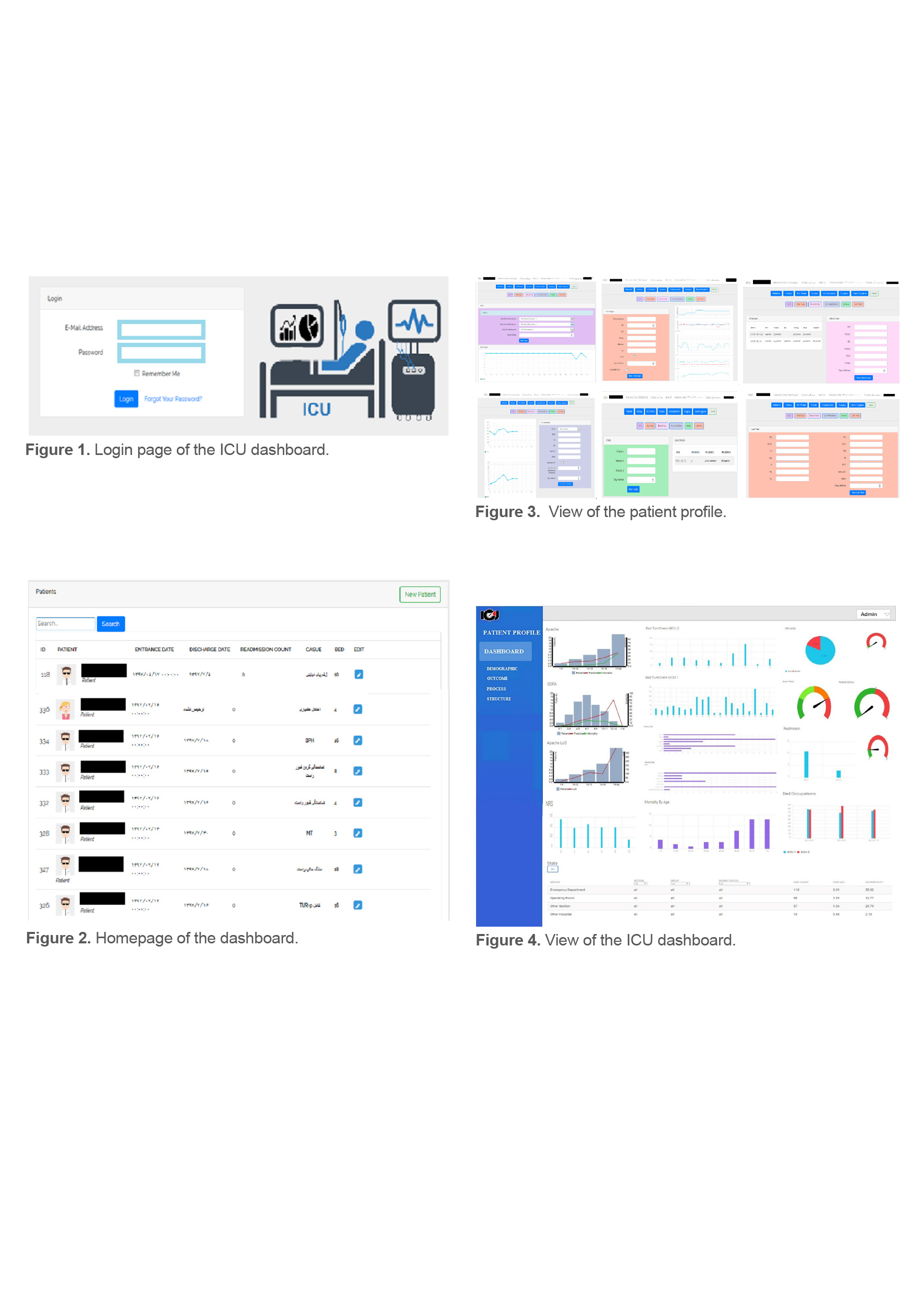
After login, the system home page appears with (1) a list of patients and (2) a new patient admission (Figure 2). Clicking on “Patient Name” opens a page titled “Patient Profile”. The patient profile contains different information forms completed by the nurse and the physician, and then the information is entered into the database (Figure 3).
These forms include identity details, clinical and managerial information fields about the patient (Table 2). How to enter information is defined in the dashboard guide.
Based on the data entered for each patient during the treatment process, the APACHE-II and SOFA scores were automatically calculated. It should be noted that required variables and the scoring algorithm were extracted from the clinical guideline.
Clinical indicators (GCS, MAP, PIP, TV, Blood glucose) with histogram charts were displayed daily in the patient profile from the time of admission to discharge (Figure 3). After entering all the patients’ information, other KPI were viewed in the management dashboard.
According to the KPI set and the required visual features, a management dashboard was set up to better manage the ICU department. Finally, the total data of the patients in the quarterly period in GICU1, GICU2 were displayed in the form of graphs and tables.
The management dashboard screen includes three menus to display output, process, and structural indicators. Each menu is categorized according to the importance of the criteria. The dashboard shown in Figure 4 is the main menu which shows the overall performance of the ICU. The user can enter the relevant category to see more details regarding the performance of each indicator.
The three-dimensional charts of the APACHE-II and the SOFA compare the percentage of predicted deaths and actual deaths. To show the indicators of mortality, bed turnover, complication, readmission, suitable charts, and graphs were used. The table at the bottom of the dashboard is for evaluating “admission number, length of stay and mortality” concerning the patient admission source “emergency room, operating room, other wards, other hospitals” (Figure 3).
After the physicians and nurses worked with different sections of the dashboard and provided their feedback, user comments were recorded and used to evaluate problems associated with the visual features of the dashboard. Finally, the following edits were made to the dashboard:
- The documentation of information in the patient profile was changed to the routine forms in the ICU.
- ‘The cause of hospitalization’ variable was added to the box above the patient profile.
- Mortality prediction percentage was displayed in the APACHE and the SOFA score.
- Changes such as categorizing indicators, changing the color of indicators, merging some charts and tables were made.
Table1. Key performance indicators
|
Key performance indicator |
|
|
APACHEII score – SOFA score-Upper Body Elevation- Stress Ulcer Prophylaxis - Therapeutic Hypothermia-GCS On Admission- RASS Score- Blood Glucose- TV- bps-VAS/NRS-Map-Pip |
Process indicators |
|
ICU mortality rate- ICU length of stay- ICU readmission rate- ICU infection rate-Duration Of Mechanical Ventilation- Number Of Unplanned Extubation- Needle Stick Injury Rate-Patient Fall Rate-Pressure Sore Rate- ICU Complication- Bed Occupancy Rate- Number Of Clinical Transport |
Outcome indicators |
|
Bed Turnover Rate- Intensivist Cover 24/7- Nurse To Patient Ratio |
Structure indicators |
Table2. Sections and variables of patient profile
|
Patient profile |
||
|
Variables |
Section |
|
|
Field, Name, Last Name, Gender, Age, High, Weight, Insurance, National Code, Entrance Date, Cause ,Doctor, Group, Type(Scheduled Surgical, Unscheduled Surgical, Medical), Functional Status(dependent, partially dependent, independent), Admission Source(emergency, operating room, other section, other hospital), ICU Section(GICU1,GICU2), Bed Number, Bed Elevation |
New Patient |
|
|
B Group, Hbs+Ag, HTN, SMO/Addict, Allergy, Specific Comorbidity, confirmed infection, CPR |
History |
|
|
Best eye response, Best verbal response, Best motor response |
GCS |
Sheet ICU |
|
T, RR, MAP, PR, BP, O2 Sat, CVP, Therapeutic Hypothermia |
Vital Sign |
|
|
PH, PCO2, BE, HCO3, PO2, O2 Sat |
Blood Gas |
|
|
Requiring Mechanical Ventilation , Mod/In/Non Invasive, TV, PIP/PSV, RR, PEEP, FIO2, Duration Of Mechanical Ventilation |
Ventilation/O2 |
|
|
Infusion1, Infusion2, Infusion3 |
Intakes |
|
|
CR, NA, K, HCT, MG, CA, BUN, HB, Plt, BS, PT, PTT, Bilirubin, WBC |
Lab Test |
|
|
Temperature (rectal),Mean arterial pressure, pH arterial, Heart rate, Respiratory rate, Sodium (serum), Potassium (serum), Creatinine, Hematocrit, White blood cell count, Glasgow Coma Scale, AaDO2 or PaO2 (depending on FiO2) |
APACHEII |
Score |
|
PaO2/FiO2 (mmHg), Glasgow coma scale, Mean arterial pressure, Bilirubin, Platelets, Creatinine |
SOFA |
|
|
Facial expression, Upper limb movements, Compliance with mechanical ventilation |
BPS |
|
|
Combative, Very agitated, Agitated, Restless, Alert and calm, Drowsy, Light sedation, Moderate sedation, Deep sedation, Unarousable |
RASS |
|
|
Hand Rub, Hand Wash |
Hand hygiene |
|
|
venous catheter infection, ventilator-associated pneumonia, vancomycin-resistant enterococci, pulmonary complications, gastrointestinal bleeding, transfusion-related complications, postoperative myocardial infarction of cardiac death, deep venous thrombosis or pulmonary embolus, Medication errors , Average days of mechanical ventilation, unplanned extubation, fall rate in ICU, Pressure sore rate |
Complication |
|
|
Surgery Name, Doctor Name, Surgery Date, Result(canceled, aware, coma, passed away), Number of Niddle Sticks |
Surgery |
|
|
Expired, location (expired ,home, other section, other hospital), cost |
Discharge |
|
Discussion
Nowadays, dashboards are used as a tool to monitor and improve the quality of performance in various departments in the health system (16,29). Regarding the designing of the dashboard, the most effective objects and graphs should be used to present diverse information in a meaningful way on one page (30). On the other hand, color is one of the important elements to highlight the areas that need attention (31). In the ICU dashboard designed for the current study, neutral colors were applied for backgrounds, borders, and icons, and also contrasting colors were utilized for graphs and gauges. Also, the font and text size are the same in all charts, the graphs’ design is based on the information provided, and the position of the charts on the dashboard is according to the importance of the indicators. Research has shown that such things are required for dashboard development (31-33). Few recommends that dashboard designers use muted rather than primary colors (31).
Shahpori et al in their study designed a dashboard to handle the ICU beds. By gathering the indexes, refining, and displaying them in the form of graphs, appropriate data were provided for administers. The results of this study showed that the dashboard created the collaboration between hospitals, convenient transfer of patients, and cut down the waiting time in the emergency room for admission in the ICU (24). In our study, bed occupancy and bed turnover in the ICU were also evaluated which resulted in better allocation of beds to priority patients through the dashboard and proper coordination between wards.
Another study was conducted in collaboration with the Pediatric Center to identify quality and safety measures in PICU. The research team members developed a web-based dashboard over 14 months. The results of this research indicated that the dashboard minimized the admission time and the rate of urinary tract infection and also enhanced the patients’ drug compatibility (25). In the current study, the web-based dashboard was implemented for 3 months, and patient safety indicators such as falling rate and unplanned extubation rate are also displayed.
John Starmer showed patients’ status in real time and prevent infection in the adult intensive care unit; implemented a management dashboard based on ventilator metrics. Clinical documentation and CPOE systems were utilized in the dashboard and data were transmitted to the dashboard through an interface engine. The dashboard screen quickly detected the status of patients at risk and received prompt care from the nurse (26). In the present study, by showing the status of patients with critical conditions as well as the status of the infectious disease, the dashboard was able to show more cooperation between members of the health care team and better follow-up of the patients’ condition.
In the study conducted by Marie Egan et al, the impact of the dashboard on workflow, quality of care, and patient safety was evaluated at Massachusetts hospital. The results of this research showed that the capability of a clinical dashboard to systematically link medical equipment in the ICU and capture real-time data can facilitate coordination between medical team members, management of the patients’ data and display information on a single screen. Therefore, it has a helpful role for improving care quality, patient safety, and clinical outcomes in the ICU (34).
Christine Bakos carried out a study in the United States entitled implementing a clinical dashboard to reduce preventable medical errors in the ICU. The target indicators studied in this study were fall reduction, medication reduction, and recommendations for reducing nosocomial infections. This dashboard was used by several providers simultaneously throughout the hospital (physician assistant, nurse, physicians, and senior management). Accessing patient information in one view, and tracking patient status provided a good opportunity to report appropriately during the changes. Many providers in this research believe in using of appropriate dashboard in the workflow (30). In the current study, the providers (nurses, physicians, and ward management) could follow the status of vital signs, medications, tests, pain indicators, performed surgeries, etc. through observing the profiles of patients. The dashboard is also a way to monitor high-risk patients with high Apache and Sofa scores. The results of our research revealed that using clinical dashboard in the ICU allowed clinicians to quickly identify changes in the patients’ condition that required intervention. Hence, it can be helpful in controlling infection and fall through providing visual information and announcing essential alerts.
Fathi et al developed a dashboard to reduce the incidence of Ventilator-Associated Pneumonia (VAP) in the intensive care unit. They used the object-oriented analysis approach, SQL database and C# programming language to design the dashboard software. This dashboard showed the progress of VAP prevention measures for each patient, and displaying alerts. After implementing the dashboard in a hospital, indicators were measured for 21 patients before and after two months the dashboard was installed. The results showed a significant difference (p-value ˂0.02) between the number of patients with VAP before and after the study. Also, the VAP prevention dashboard improved teamwork and collaboration between employees (21). In the current study, MySQL database and PHP programming language were utilized to develop the dashboard. The patient treatment process is observed with graphs at a glance. The doctors and nurses can view and follow the information. Also, for information security, a different level of access was defined for each group of users, and ultimately led to better cooperation between staff and early detection of at-risk patients with Apache and Sofa scores.
de Lusignan et al conducted the study entitled ‘Atrial fibrillation dashboard evaluation using the think aloud protocol’. Participants were asked to work on the four main sections of the dashboard and verbalize their cognitive. Then changes included simplifying the labelling, limiting the numerical information and changing the nomenclature according to standards used in other national guidelines. They also included links to additional documentation that provided details regarding how certain values displayed in the section were calculated. The anticoagulation dosing section was enhanced by introducing a simplified taxonomy for anticoagulant dosing which would be more insightful for practice staff (35).
The think aloud method helped to increase adoption rates of dashboard products and in turn had a significant impact towards improving the data quality, resulting in better management of AF in primary care (35). In the current study, we also utilized the method of long thinking. The results of the evaluation lead to designing better graphs and colors used in the design of the ICU sheet, moving some indicators, and adding some elements.
One of the most important features of the designed dashboard is the ability to view the results of changes in indicators over time and the relationship between them. For example, the dependence of Apache and Sofa scores on mortality and length of stay in patients, the effect of prophylaxis on length of stay, and the impact of age on the rate (admission, mortality, and length of stay), etc. were considered. The real-time recording of data of the patients and visual display of clinical indicators, enhances performance monitoring in the ICU. The current item can be a useful tool in better understanding of the patients’ clinical condition for the sake of providing proper care.
Furthermore, as the dashboard is web-based, physicians have access to patients’ information regardless of time and space restrictions, and they can monitor their symptoms even when they are not present.
It also enables managers to monitor the healthcare quality of the ICU department in real-time based on key performance indicators.
Ethics approval and consent to participate
The study was approved by the Ethics Committee and Research Council of Urmia University of Medical Sciences. (Ethical code number: ir.umsu.rec.1396.351)
Consent for publication
Not Applicable.
Competing interests
The authors declare that they have no competing interests.
Acknowledgements
This study was reviewed and approved by the institutional research ethics committee of Urmia University of Medical Sciences (Ethical cod number: ir.umsu.rec.1396.351).
Funding
This study was funded by Urmia University of Medical Sciences (registered number 8001).